I used to be a content writer for a small web design agency and my first article was about website design best practices.
I remember my manager going through it and telling me: “It’s all good, but web design isn’t just about making things look good.”
I was young and fresh back then, and to be honest it sounded completely backwards.
Didn’t make any sense. For me, design was all about what I saw. I mean, it’s visual, right? Of course, appearance should be everything.
Now, any web designer hearing this would probably be ready to tear their hair out.
Today I understand it. Web design is all about functionality, user experience, and ensuring that every element on the page serves a purpose.
So let’s look at the top web design best practices for 2024 to get your website doing the job – converting visitors into paying customers. I’ll also cover important design guidelines and requirements that you should also keep in mind.
12 Website Design Best Practices
- Choose typography that is easy to read and skim.
- Pay attention to automatic translation.
- Choose a color scheme that fits your brand.
- Use spaces to break up text and other elements.
- Use texture to add personality and depth.
- Add images to engage and inform readers.
- Simplify your navigation.
- Make your CTAs stand out.
- Optimize for mobile devices.
- Limit the options shown to users.
- Prioritize functionality over aesthetics.
- Choose content that your users will understand.
1. Choose typography that is easy to read and skim.
Typography refers to the way letters and characters (type) are arranged and presented on the page. Since Because a website’s typography affects not only how we read, but also how we think about the text on a webpage, choosing carefully is important.
Ideally, you want a font that:
- Easy to read
- Easy to skim
- Accessible to all users
- Readable on multiple devices and screen sizes
You also want it to fit the look and feel of your brand.
For example, the luxury fashion brand Burberry has updated its logo for the first time in 20 years in 2018. The old serif font was replaced with a bold, all-caps sans serif font and the knight emblem was removed.
The result was a simpler and more modern logo that is easier to read on any screen – and that reflects the company’s changes to become more transparent and appeal to a younger generation.

But then, in February 2023, creative director Daniel Lee arrived reintroduced Burberry’s new logo. This time we’re talking about something completely different – a modern blue design that’s reminiscent of its British heritage.

Why did this change happen?
Fashion brands often update their logos when a new creative director comes on board who reflects their vision. When Lee joined Burberry in October 2022, he wanted to honor Burberry’s past while embracing the future. He called the logo “a modern take on British luxury” and “a new chapter for the brand.”
While I personally liked the first version a little better, the second logo and its typography have a story and meaning.
2. Pay attention to automatic translation.
Test how automatic translation affects your website content.
Many users rely on translation tools when navigating your website. Therefore, make sure your design does not cause confusion or misunderstanding. Pay attention to layout, spacing and typography – the translated text must fit well and remain readable.
Let’s bring it to life.
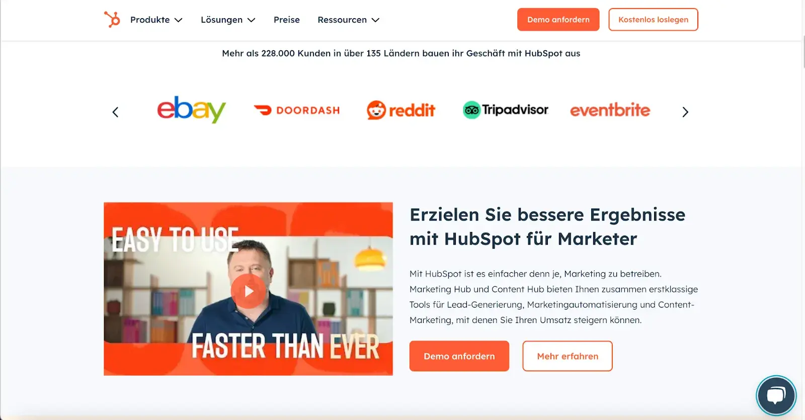
I translated HubSpot’s website from English to German. The result? A polished translated website without extra spaces, strange letters or structural problems. Everything looks neat, just like the original:
“At Wrike, we use TT Norms Pro because of its clean, modern aesthetic and readability across devices – accessibility is essential. It is neutral, inspires trust and has multilingual character sets so that the materials look elegant even after translation,” he shares Elisa Daniela Montanari, Head of Organic Growth and Website Strategy Wrike.
According to Montanari, a great font should be adaptable to different platforms, pages, and audiences.
“With the clean lines of the TT Norm Pro, it doesn’t compete with our look and message, but complements it,” says Montanari.
3. Choose a color scheme that fits your brand.
Like typography, color can influence not only how we understand and interact with content, but also how we feel about it. Your color scheme should therefore meet the same criteria as your website’s typography. It should:
- Strengthen your brand identity.
- Make your website easy to read and navigate.
- evoke emotions.
- Looks good.
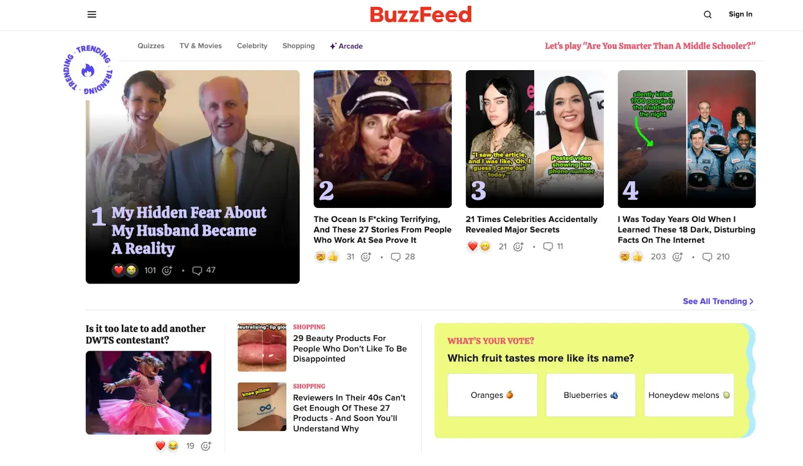
Buzzfeed, for example, uses the primary colors yellow and red to attract users’ attention and get them excited about the content. The use of the basic color blue, which is associated with trust, is reserved exclusively for links and CTA buttons. Both emotions are ideal for evoking on a media site.
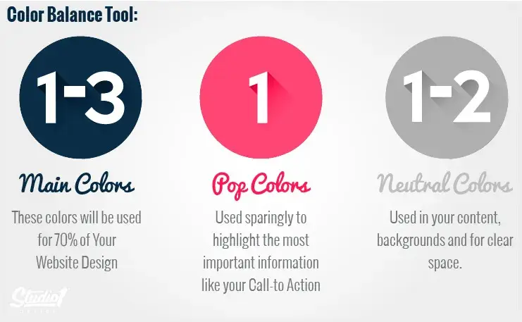
I recently came across one great part by Greg Merrilees, CEO and Founder of Studio1 Design, who highlights the importance of finding the right balance.
He suggests thinking about color harmonies – when choosing a color palette, start with your dominant color and then layer it up. Darker colors draw attention first and have more visual weight, so you should transition back to lighter colors from there.
4. Use spaces to break up text and other elements.
Whitespace provides users with visual breaks while editing a website’s design or content, which is aesthetically pleasing but also offers other benefits.
By minimizing distractions, whitespace makes it easier for users to focus, process information, and understand what’s important.
This means you can use whitespace to avoid information overload or analysis paralysis – and to highlight important elements on the page.
This can help motivate users to take a specific action, such as: E.g. sign up for a newsletter, shop your latest collection and more.
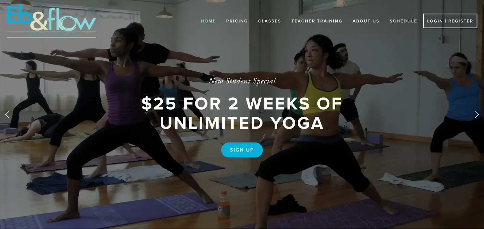
For example, Eb & Flow Yoga Studio uses whitespace to guide users to a specific action: sign up for three weeks of classes. Note that spaces do not mean absence of color or images.
Instead, it means that each element on the page is strategically positioned, leaving plenty of space between them so as not to overwhelm or confuse visitors.
One of the best insights I’ve gotten on this topic comes from Sean Lee Amies, CEO and founder at Square One Digital, who explained it perfectly.
“Take Google, for example. They are huge. “There are endless things they could be talking about, and yet the only thing on their homepage is a logo, a search bar and two buttons,” says Lee-Amies.
“Whitespace is always the first casualty of a web design created by people who have not yet learned to use a “less is more” approach to content and communication.”
5. Use texture to add personality and depth.
Weaving textures resemble a three-dimensional, tactile surface and aim to reproduce the physical sensation of touch with another sensation – vision.
They are a great design alternative to solid color backgrounds, especially if you want to add personality and depth to your website.
Check out the texture below on the homepage of Santa Barbara-based restaurant Mony’s Tacos.
It looks like it was drawn with chalk on a blackboard, doesn’t it?
I don’t know about you, but I can almost feel the chalk on my fingers just by looking at it. It’s the perfect look for a restaurant that wants to be California’s preferred choice in the Funk Zone for Mexican delights.

6. Add images to engage and inform readers.
When designing a website, it is important to find a balance between text and images. Incorporating images can make your content more informative, engaging, and memorable. For some people, it is easier to learn and process information visually.
Here is a unique example of dividing text with images on a cosmetic company’s website. This shows how endless the possibilities are when incorporating images into your website design.
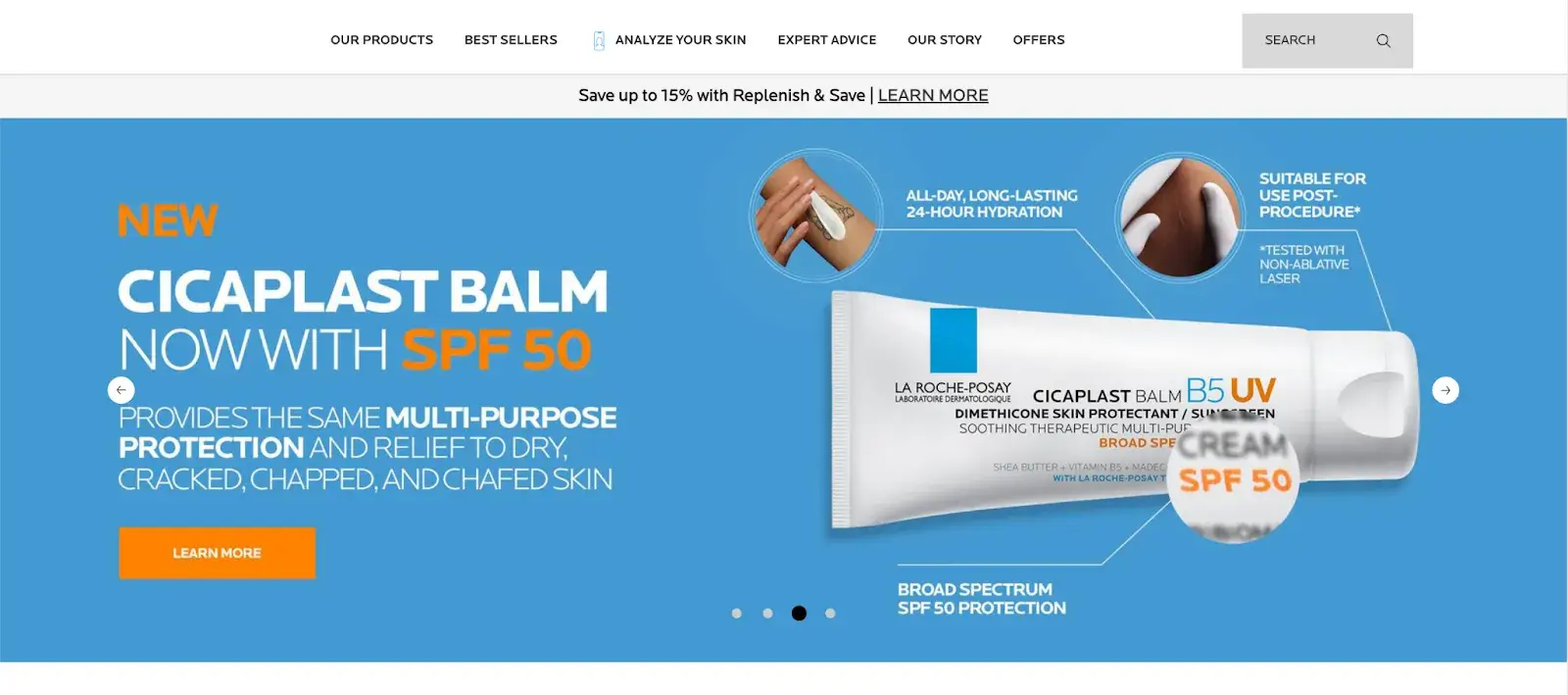
Images should be part of your entire website, not just the homepage, but must be used carefully and balanced.
The design team from Dgtl InfraFor example, creates blog posts with images every 200-300 words and sees 40% more shares than text-heavy articles. You aim for a text-to-image ratio of 60/40.
This balance captivates readers without sacrificing substance. The team uses a mix of infographics, product shots and relevant stock images.
Every image should serve a purpose. Randomly inserted images can do more harm than good. Each should either illustrate a point or provide a visual break from a natural pause in the content.
7. Simplify your navigation.
Navigation is one of the most important design elements of a website. It affects whether visitors arrive on your homepage and browse or click the back button. That’s why it’s important to keep it as simple as possible.
Many websites opt for a horizontal navigation bar. This navigation style lists the most important pages side by side and is placed in the website header.
Take the navigation bar on Blavity as an example. The main navigation categories (Entertainment, Culture, Small Business, Blavity U, Blavity Brands, Digital Cover) are clearly labeled and easy to identify.
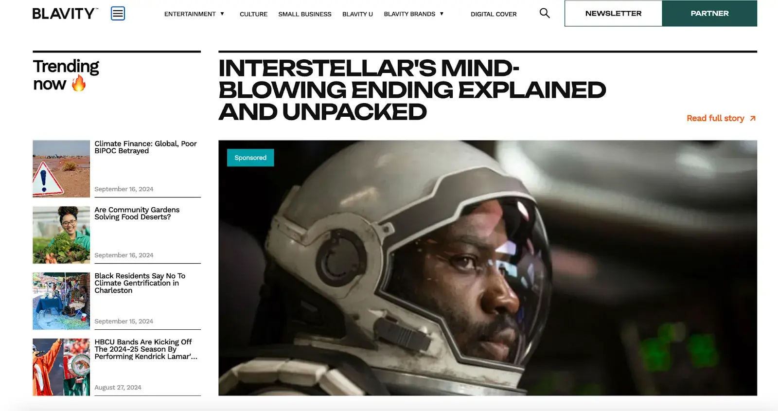
Using a drop-down menu for the Blavity category adds a layer of organization without overwhelming the user with too many options at once. This is a subtle visual cue to help the user navigate.
The search bar is located in the top right corner and provides users with a convenient way to find specific articles or topics.
8. Highlight your CTAs.
CTAs are elements on a webpage, ad, or other content that encourage the audience to do something. The call to action could include, but is not limited to, sign up, subscribe, start a free trial, or learn more.
You want your CTAs to show up in your website design. To achieve this, consider how you use colors and other elements such as background color, surrounding images, and surrounding text.
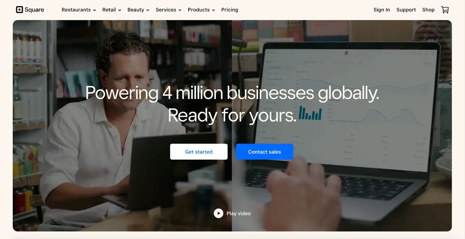
Square offers an excellent call-to-action example. With a gentle video background, Square shows how unique and forward-thinking its product is. Against this dramatic backdrop, you can expect the white “Get Started” CTA and “Contact Sales” in a striking blue color.
Damon Culbert out of Add people also suggests encouraging CTAs, but in a balanced way.
He says a subtly animated button that wiggles or pulsates after a delay can grab attention without being intrusive. Triggering such animations only after a user has spent time on the page ensures that the interaction feels timely and relevant.
This technique, similar to well-timed pop-ups, respects the user’s browsing flow and effectively directs their focus towards conversion.
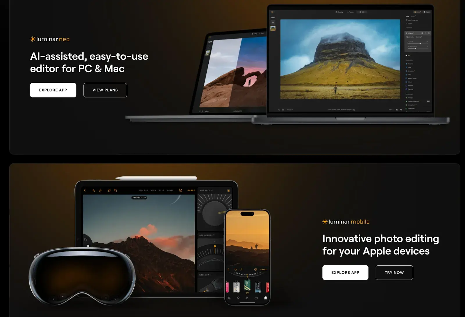
While the design of a button is important, we cannot ignore its content: the text it contains. Yevheniy Tymoshenko, CMO at Skylumtouched on this during our conversation and said:
“We recently redesigned the layout of our website by placing CTAs at the top and bottom of the page. We also reworded them to make them more actionable. Now they say “view plans” and “explore app” and speak directly to the customer without using pushy language like “buy now.” As a result, our conversion rates increased by 12%,” says Tymoshenko.
9. Optimize for mobile devices.
We have already discussed the importance of your website being responsive. This could mean changing or removing some elements that would clutter smaller screen sizes or negatively impact loading time.
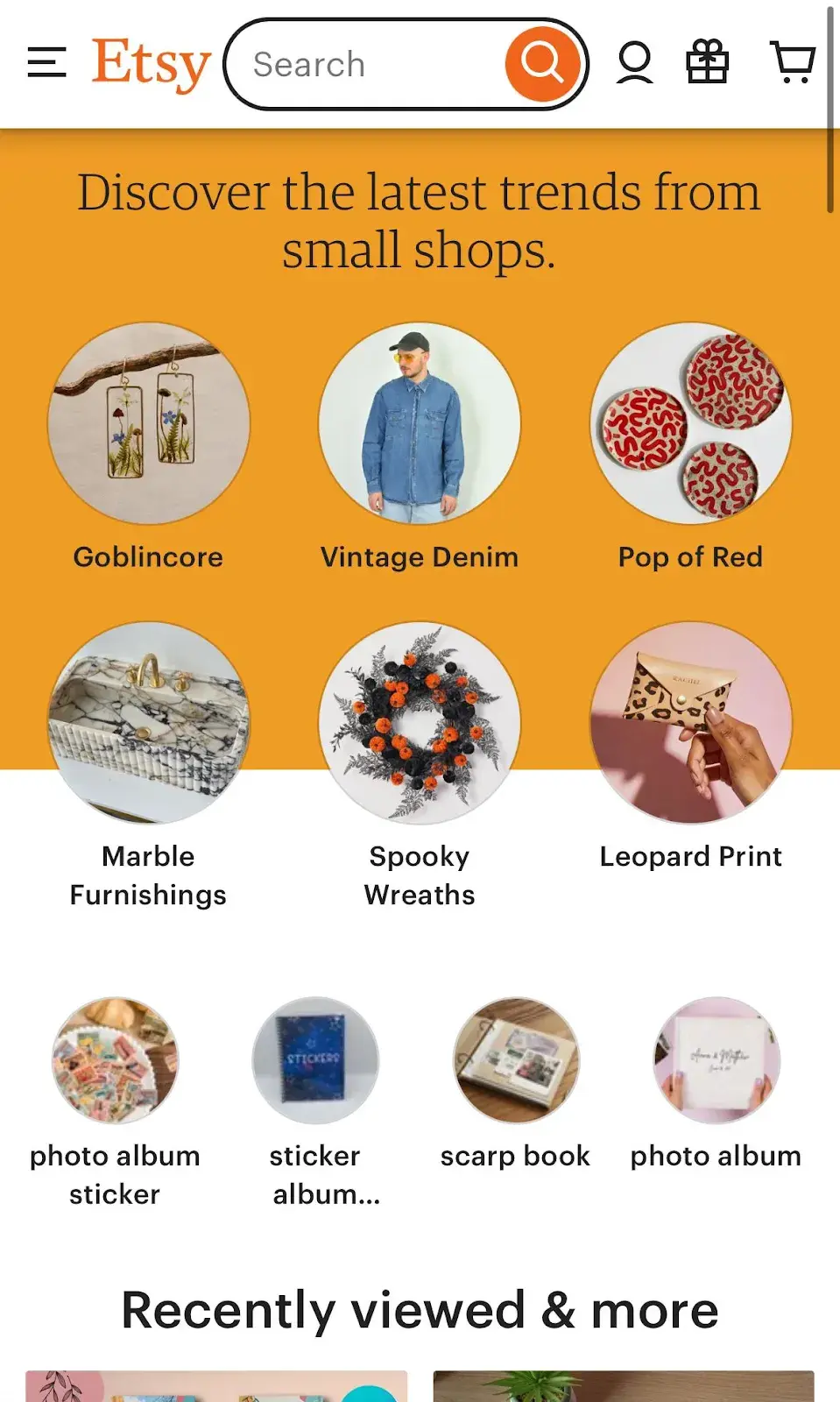
For an example of one of the best website designs, see how the Etsy homepage on desktop compares to that on mobile. On the desktop you will see a navigation bar with categories. When you hover over each category, a drop-down menu will appear.

On mobile devices, this appears behind a hamburger button, improving the appearance and performance of the mobile site. You’ll also notice that the images are larger – perfect for tapping your finger on a mobile device screen.
Claire Escobedo out of Online optimism says that, in her opinion, one of the biggest mistakes in mobile design is the lack of accessibility features. This includes things that violate WCAG standards and features like hover effects that affect the functionality of a website.
She continues: “You can’t drive around on a phone! You need to consider mobile interactions when designing a website that will be accessed via a mobile device, which is pretty much all websites these days.”
According to Escobedo, just because your site’s navigation works well on desktop doesn’t mean it will carry over to mobile.
“A nice mega menu is nice for a laptop user, but how is a mobile user supposed to access the same four levels of links?” notes Escobedo.
10. Limit the options shown to users.
According to Hicks’ Law, an increasing number and complexity of choices leads to an increase in the time it takes a person to make a decision. This is bad news in website design.
If a website visitor is presented with too many options, they may become frustrated and bounce – or they may choose an option you don’t want, such as: B. by abandoning his shopping cart. This is why it is important to limit the number of options presented to a user.
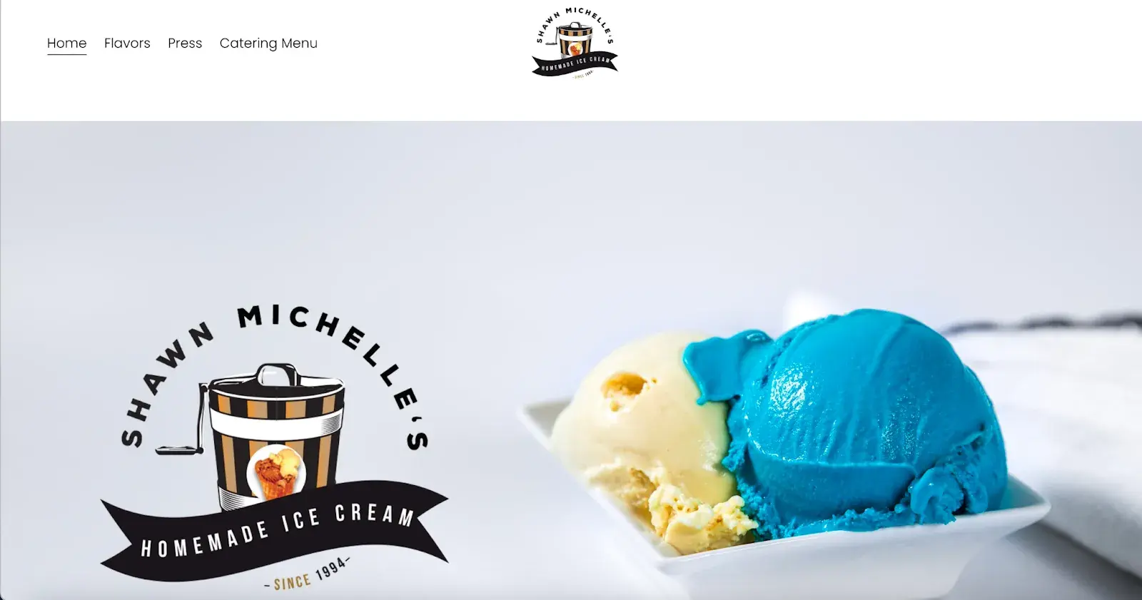
For example, when a visitor lands on Shawn Michelle’s Ice Cream homepage, they have three clear options: learn more about the company, explore the flavors, or take a look at the catering menu.
It is clear and all important information is easy to find. Does a site like this need anything more? Absolutely not. Everything is right there, making it easy for customers to get what they need and reducing the likelihood of them leaving frustrated.
This is a perfect example of Hicks Law in UX design.
Pro tip: Don’t have time to follow the rules? You can download one at any time ready-made website template This will form a solid foundation for your website.
11. Prioritize functionality over aesthetics.
“Design should support content and functionality – not the other way around. The vast majority of users visit your website because of the information it contains, not because of the way it looks.
As a designer, I know how great it is when a website looks good, but that should never come at the expense of the functionality and understandability of your website for all users,” says Escobedo.
Focus on functionality rather than just aesthetics. Create solutions that are user-friendly, reliable, practical, and put users’ needs first.
12. Choose the content that your users understand.
Website content should be straightforward and not require all your intelligence to understand it while providing value. Since this is not an easy task, I asked Damon Culbert again for advice:
“In order for people to spend time and energy doing something, like reading through all the features of a new product or service, you have to create a compulsion in them to do it,” says Culbert.
Culbert says strong visuals allow people to invest time and energy in learning more about something you’re trying to sell.
“B2B services are a good example of this; They are often very complex and are not understood by laypeople. For a non-expert, it could take an hour or more to gain a basic understanding,” says Culbert. “Or they could look at an image that gets them there in five seconds or less.”
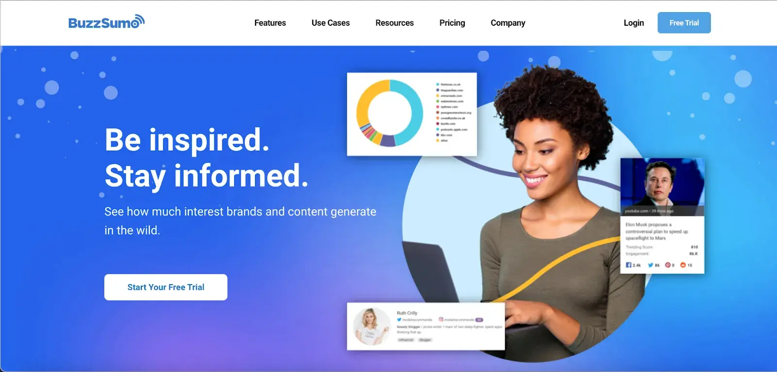
A good example is BuzzSumo’s homepage. It delivers a clear, concise message with images like magazine excerpts and social media screenshots, making what they do clear – even to first-time visitors.
My last point: People don’t spend money on things that they don’t understand whether they add value or not. This is why commercially successful companies invest in marketing and sales intelligence tools to understand their customers’ buyer journeys and hurdles.
Now you could spend years studying the ins and outs of web design.
However, to give you a starting point, we’ve put together a list of basic guidelines and best practices you can use when redesigning or launching your next website.
9 Website Design Guidelines
- simplicity
- Visual hierarchy
- navigability
- consistency
- Responsiveness
- accessibility
- conventionality
- credibility
- User orientation
1. Simplicity
While the appearance of your website is certainly important, most people don’t visit your website to judge how slick the design is. You want to complete an action or find specific information.
Therefore, unnecessary design elements (those that serve no functional purpose) will only overwhelm visitors and make it more difficult to achieve what they want to achieve.
From a usability and UX perspective, simplicity is your best friend. If you have all the necessary page elements, it is difficult to get them to simply. You can apply this principle in different forms, such as:
- Colors. The basic rule is: don’t use it much. The Handbook of Computer-Human Interaction recommends using a maximum of five (plus or minus two) different colors in your design.
- Fonts. The fonts you choose should be easy to read, so don’t be too artsy and use minimal script fonts, if any. Again, keep the text color minimal and always make sure it contrasts with the background color. A general recommendation is to use a maximum of three different fonts in a maximum of three different sizes.
- Graphic. Only use graphics when they help a user complete a task or perform a specific function (don’t just add graphics).
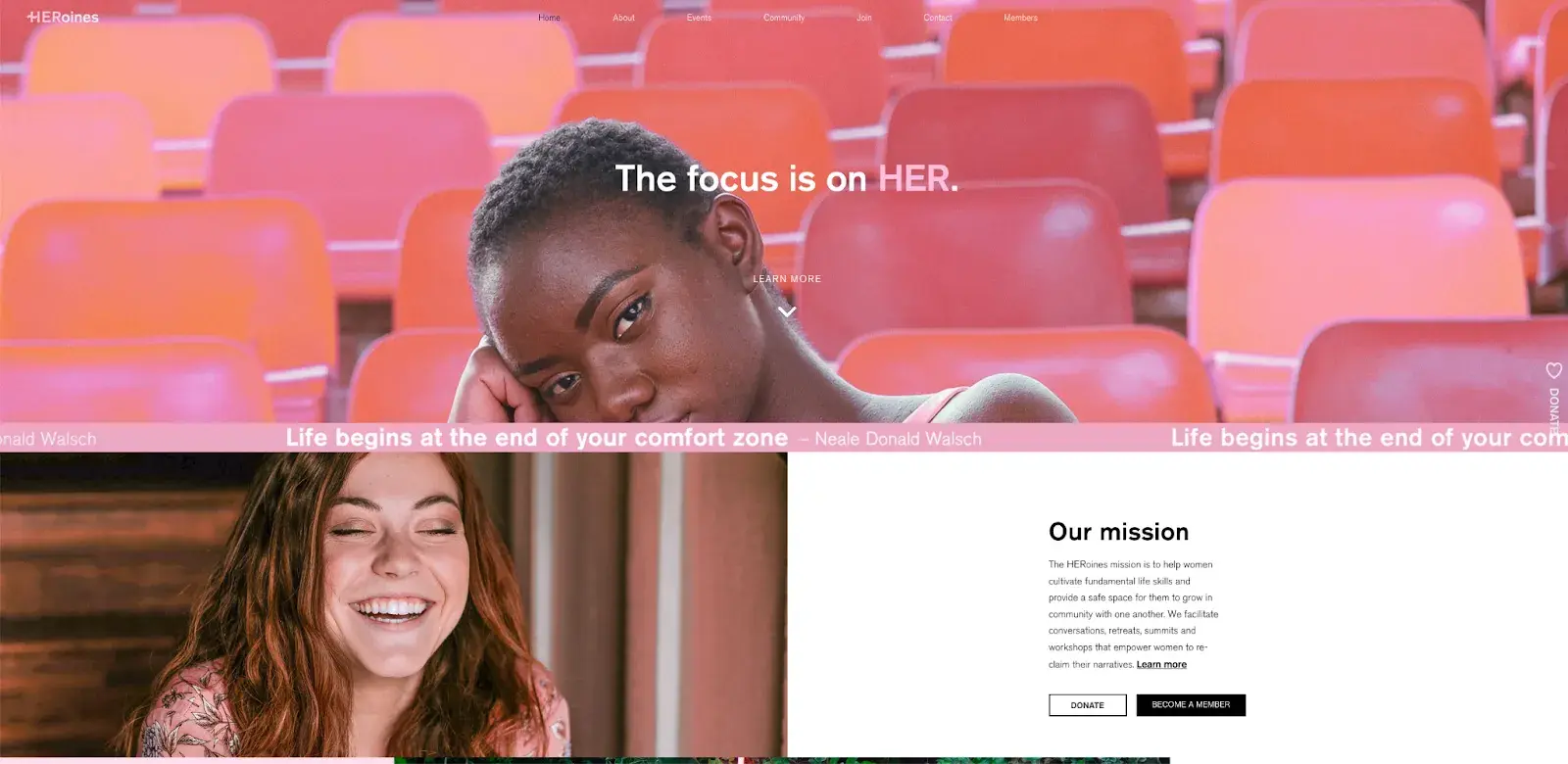
Here’s a great example of a simple but effective homepage design from HERoines Inc.
2. Visual hierarchy
Visual hierarchy is closely related to the principle of simplicity and means arranging and organizing website elements in such a way that visitors naturally gravitate to the most important elements first.
The goal is to get visitors to take a desired action, but in a way that feels natural and comfortable. By adjusting the position, color, or size of certain elements, you can structure your website so that visitors are drawn to those elements first.
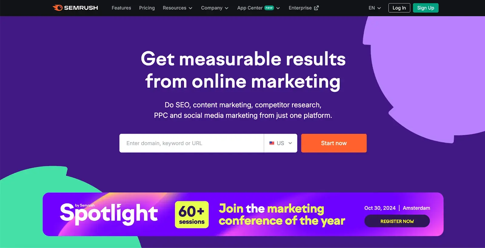
The SEMrush website is a great example of what visual hierarchies should look like. The prominent placement of the “Start Now” button, paired with clear typography and plenty of white space, ensure that it stands out.
Secondary elements like the input field and heading support the primary CTA and provide context. This well-executed visual hierarchy makes the site easier to navigate and easier to understand its purpose.
3. Navigation ability
Planning intuitive navigation helps visitors find what they are looking for.
Ideally, a visitor lands on your page and doesn’t have to think long about where to click next. The transition from point A to point B should be as smooth as possible.
Here are a few tips to optimize your website navigation:
- Keep your primary navigation structure simple (and at the top of your page).
- Add navigation to the footer of your website.
- Consider using breadcrumbs on every page (except your homepage) to help users remember their navigation path.
- Include a search bar at the top of your website so visitors can search for keywords.
- Don’t offer too many navigation options per page.
- Include links in your page text and make it clear where those links lead.
- Don’t let users dig too deep. Try creating a simple wireframe map of all the pages on your website, arranged like a pyramid: your homepage is at the top, and each linked page from the previous one forms the next level. In most cases it is best to keep the map no deeper than three levels.
Another note: Once you’ve decided on the main navigation (top) of your website, make sure it stays consistent. The labels and position of your navigation should remain the same on every page.
This leads us nicely to our next principle below.
4. Consistency
In addition to consistent navigation, the overall look and feel of your website should be similar across all pages on your site.
Backgrounds, color schemes, fonts, and even the tone of your writing are all areas where consistency has a positive impact on usability and UX.
That doesn’t mean every page should have the same layout. Instead, create different layouts for specific page types (e.g. landing pages, informational pages, etc.).
By consistently using these layouts, visitors can more easily understand what type of information they are likely to find on a given page.
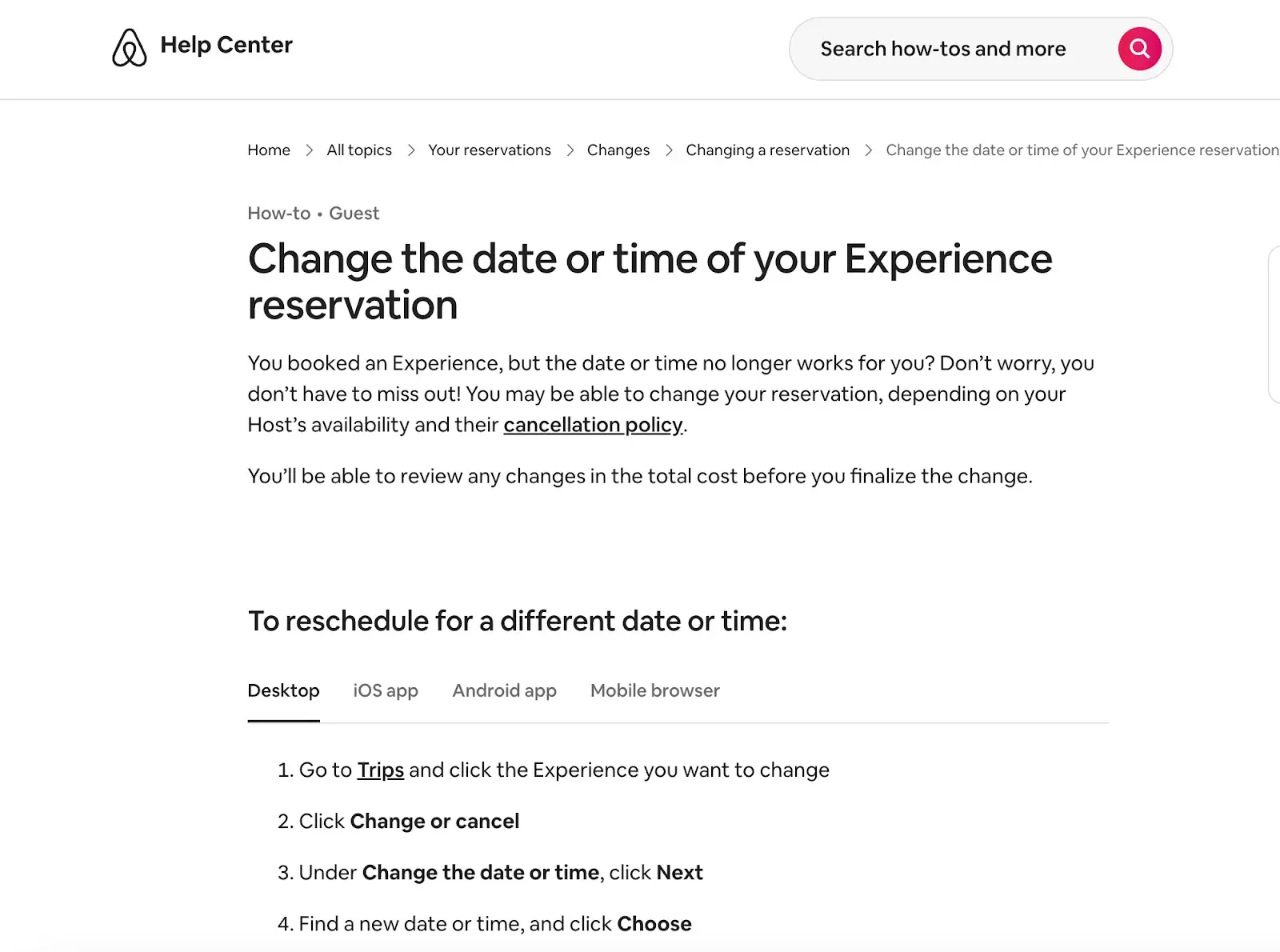
You can see this in the example below Airbnb uses the same layout for all “Help” pages, a common practice. From a visitor’s perspective, imagine what it would be like if each “Help” page had its own unique layout.
There would probably be a lot of shrugging.

5. Responsiveness
It accounts for 60% of global page views from mobile devices such as smartphones and tablets, according to Statista.
To deliver a truly great user experience, your website needs to be compatible with the many different devices your visitors use. In the technology world, this is called responsive design.
Responsive design means investing in a highly flexible website structure. A responsive website automatically resizes and rearranges content to fit the dimensions of the device a visitor is currently using.
This can be achieved using mobile-friendly HTML templates or by creating a dedicated mobile website.
Escobedo points out that one of the biggest problems she often encounters is pages that are way too long.
Avoid endless scrolling on mobile devices by making content collapsible or including links to other pages instead of repeating content on the page.
Also, make sure your external links open in new tabs and that you don’t use text that’s too small to read on mobile devices.
6. Accessibility
The goal of web accessibility is to create a website that everyone can use, including people with disabilities or limitations that affect their browsing experience. As a website designer, it is your job to consider these users in your UX plan.
Like responsiveness, accessibility applies to your entire website: structure, page format, visual elements, and written and visual content.
The Web Content Accessibility Guidelines (WCAG)Developed by the Web Accessibility Initiative and the World Wide Web Consortium, sets the guidelines for web accessibility. In the broadest sense, these guidelines state that websites must be:
- Noticeable. Visitors are aware of the content on your website.
- Operable. The functionality of your website should be possible in different ways.
- Understandable. All content and warnings are easy to understand.
- Robust. Your website is usable across various assistive technologies, devices and browsers.
“At Online Optimism, we adhere to a minimum of WCAG Level A for all website builds, with most of our sites being Level AA and some being Level AAA,” says Escobedo.
Escobedo shares a few simple accessibility tips, including:
- Adding alternative text for all non-decorative images.
- Use descriptive link text.
- Use visual cues like underlines for links.
- Activate focus states.
- Information or features may not be hidden in hover states or in images without alternative text or descriptions.
- Use of form field labels.
For more information on this topic, see our web accessibility guide.
7. Conventionality
A big challenge in web design is balancing originality and your expectations. Most of us are experienced internet users and there are certain conventions that we have become accustomed to over time. These conventions include:
- Place the main navigation at the top (or left) of a page.
- Placing a logo in the top left (or center) of a page.
- Make the logo clickable so a visitor always goes back to the homepage.
- Links and buttons that change color/appearance when you hover over them.
- Using a shopping cart icon on an eCommerce website. The icon also has a number plate that shows the number of items in the shopping cart.
- Make sure image sliders have buttons that users can click to manually rotate slides.
While some may choose to throw these out the window for the sake of uniqueness, this is a mistake. There is still plenty of room for creativity within the limitations of web conventionality.
Let’s briefly look at another area of design: architecture. Building regulations ensure that people can use spaces safely. Architects do not ignore these rules because they ensure safety and comfort. No matter how impressive a building looks, if the stairs are uneven or you can’t get out in a fire, stay outside.
In the same way, you can create an unforgettable experience while meeting user expectations. If you violate user expectations, they may feel uncomfortable or even frustrated with your website.
8. Credibility
Adhering to web conventions gives your website credibility. In other words, it increases the level of trust your website conveys. And if you strive to create a website that offers the best possible user experience, credibility matters a lot.
One of the best ways to improve your credibility is to speak clearly and honestly about the product or service you are selling. Don’t make visitors trawl through dozens of pages to find out what you do. Be at the forefront of your homepage and make it a point to explain the value of your work.
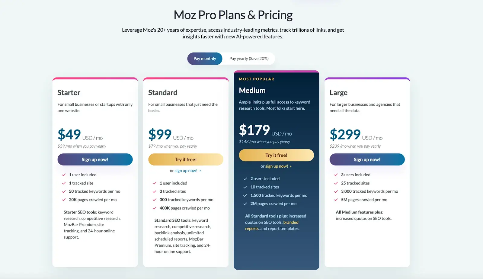
Another credibility tip: Have a pricing page linked on the homepage. Instead of forcing people to contact you to find out more about pricing, list your prices clearly on your website. This makes your company appear more trustworthy and reputable.
Here is an example of an effective one Pricing page from Moz website:
9. User-centricity
Ultimately, usability and user experience depend on end-user preferences. If you don’t design for them, who are you designing for?
While the principles in this list provide a good starting point, the final key to improving your website’s design is to conduct user testing, collect feedback, and implement changes based on what you’ve learned.
And don’t bother testing the usability yourself. You’ve already invested a lot of time into your design, which brings your own biases into the equation. Attract testers who have never seen your website before, just like any first-time visitor.
Here are some user testing tools to get you started:
- Website Grader. Our free tool evaluates your website based on multiple factors: mobile, design, performance, SEO and security. Tailored suggestions for improvement are then made. For more information about Website Grader, see our dedicated blog post.
- Crazy egg. Track multiple domains under one account and gain insights into your website performance using four different intelligence tools: Heat mapScroll card, overlay and confetti.
- Loop11. With this tool you can easily create usability tests – even if you have no HTML experience.
- The user is drunk. Pay Richard Littauer to get drunk and review your website. Don’t you believe me? We tried it.
For more helpful options, check out our list of the best user testing tools.
Now we understand the principles and best practices that should guide you throughout the design process. In the next section, we’ll go over the essential page elements that you should definitely include in your design plan.
Website design requirements
- Header and footer
- Menu navigation
- Search bar
- Branding
- Color palette
- Headings
- Clear labels
- Visuals and media
- Calls to action (CTAs)
- Space
1. Header and footer
The header and footer are a basic part of almost every modern website. Try to include them on most of your pages Home page, to your blog posts, and even to your “No Results Found” page.
Your header should include your branding in the form of a logo and organization name, menu navigation, and possibly a CTA and/or search bar, as long as it is well-spaced and minimal.
On the other hand, many users instinctively scroll your footer for important information. In your footer, place contact information, a signup form, links to your shared pages, legal and privacy policies, links to translated versions of your website, and social media links.
2. Menu navigation
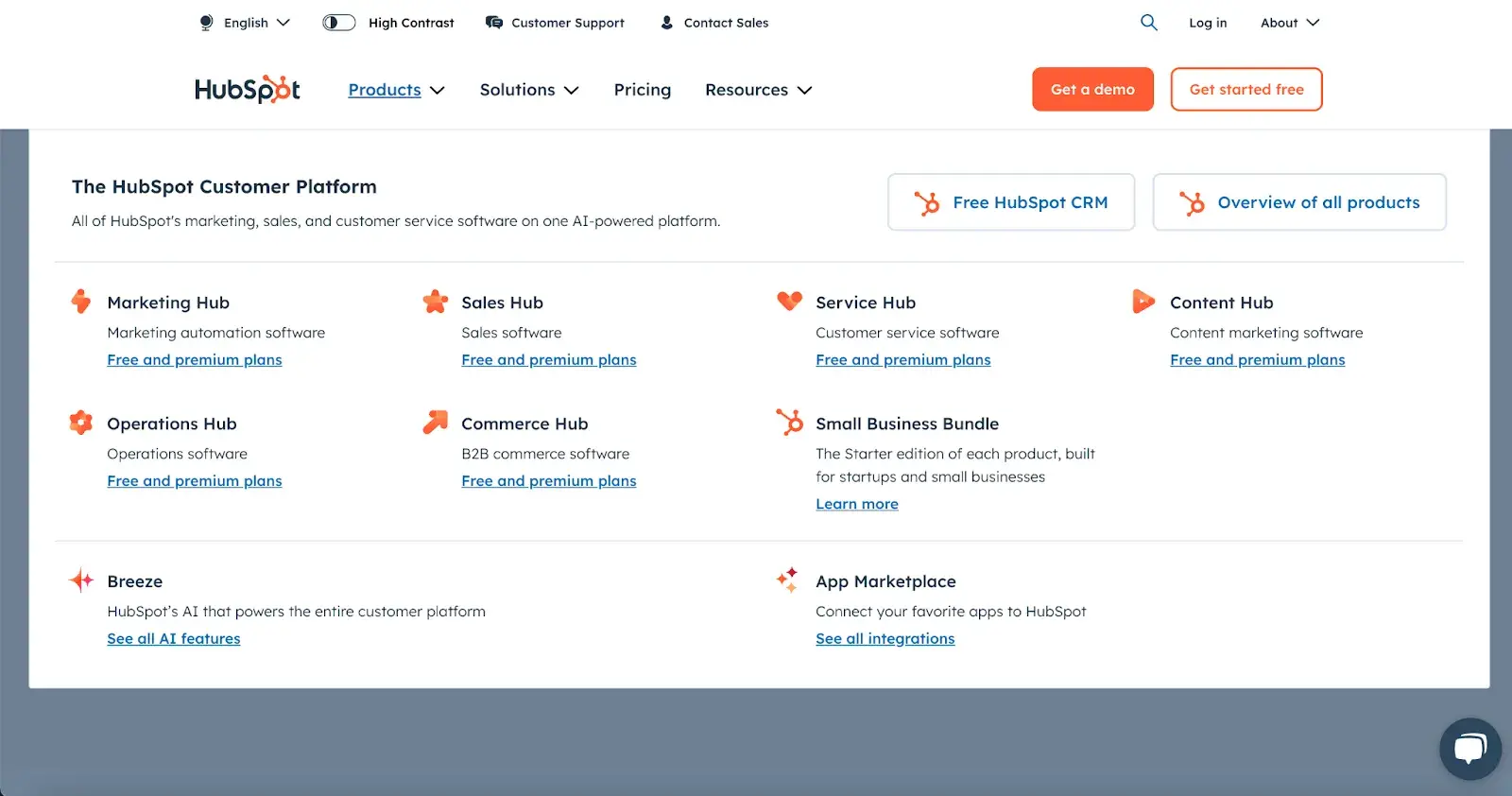
Whether it’s a list of links in the header or a neat and compact hamburger button in the corner, every website needs a navigation guide that is at least positioned at the top of your homepage and other important pages. A good menu limits the number of clicks to get to any part of your website to just a few.
To reduce clutter, you might consider converting some or all of the menu options into a drop-down menu with links within it, as seen here HubSpot homepage.
3. Search bar
In addition to menu navigation, be sure to consider placing a search bar at the top of your pages so that users can search your site for content based on keywords.
Incorporating this functionality ensures that your results are relevant, forgiving of typos, and a rough keyword match is possible.
Most of us use a quality search engine every day, be it Google, Amazon, YouTube or elsewhere. They all set the standard for your own website search.
4. Branding
Remember the conventions we discussed?
One you see practically everywhere is a logo in the top left corner. When they first land, many visitors’ eyes will instinctively wander to this region to check if they are in the right place. Don’t leave her hanging.
To reinforce this idea, incorporate your company’s branding into every element you add, every content you publish, and every color scheme you create.
That’s why I recommend you set brand guidelines if you haven’t already. Checkout Our style guide for reference.
Pro tip: Create a unique online presence with HubSpot Brand Kit Generator, This allows you to easily customize logos, icons and color palettes by entering your company name, industry and slogan.
5. Color palette
Color choice also plays an important role in the usability and UX of your website. This decision tends to be more subjective than other requirements on this list.
But like everything else we’ve discussed, try to simplify – limit your color choices to three to four standout colors at most.
Creating a color palette from scratch can be surprisingly difficult the first time. We seem to intuitively recognize which colors go well together and which don’t, but we stumble when we try to choose one from the infinite combinations available.
The solution? Try a color palette that’s proven to work on other sites. Get inspiration from your favorite sites and check out our list of our favorite website color schemes to get you started.
P.S There are many free website design tools that can suggest color palettes and do a lot of the work for you. So be sure to check these out for inspiration when you get stuck.
6. Headings
Headings are key to building the visual hierarchy we discussed earlier, especially on pages with a lot of text.
As users skim your pages, you need a clear and concise headline to alert readers to stop scrolling after they find what they’re looking for.
Only use as many headings as there are different sections on your page, as too much enlarged and bold text will weaken this effect.
7. Delete labels
Whenever a user takes an action on your website, it must be clear what they are doing and/or where they are going. All buttons should have clear text or an icon to accurately and succinctly signal their purpose.
The same goes for in-text links and widgets (simple interactive elements like dropdowns and text forms).
For example, a button that leads to a pricing page should just say “Prices” – anything beyond that (e.g. “See our pricing”, “Check out the pricing page for a deal”) is unnecessary. A search bar/button only needs a search glass icon (🔍) and possibly the word “Search” to indicate its purpose.
User testing can be a big help here. While you know what all of your interactive page elements do, the same cannot be said for a new user.
Testing gives you valuable insight into what users think about the meaning of your labels, beyond your own perspective.
8. Visuals and Media
When incorporating static images, GIFs, videos, and other media into your pages, remember to be consistent and intentional with your choices.
These elements will grab the attention of most other text and are likely to stay in users’ minds, so choose wisely.
Here is just one example of effective media on a homepage. Notice how each image complements the site’s aesthetic and supports the offering of personalized fitness training with results.
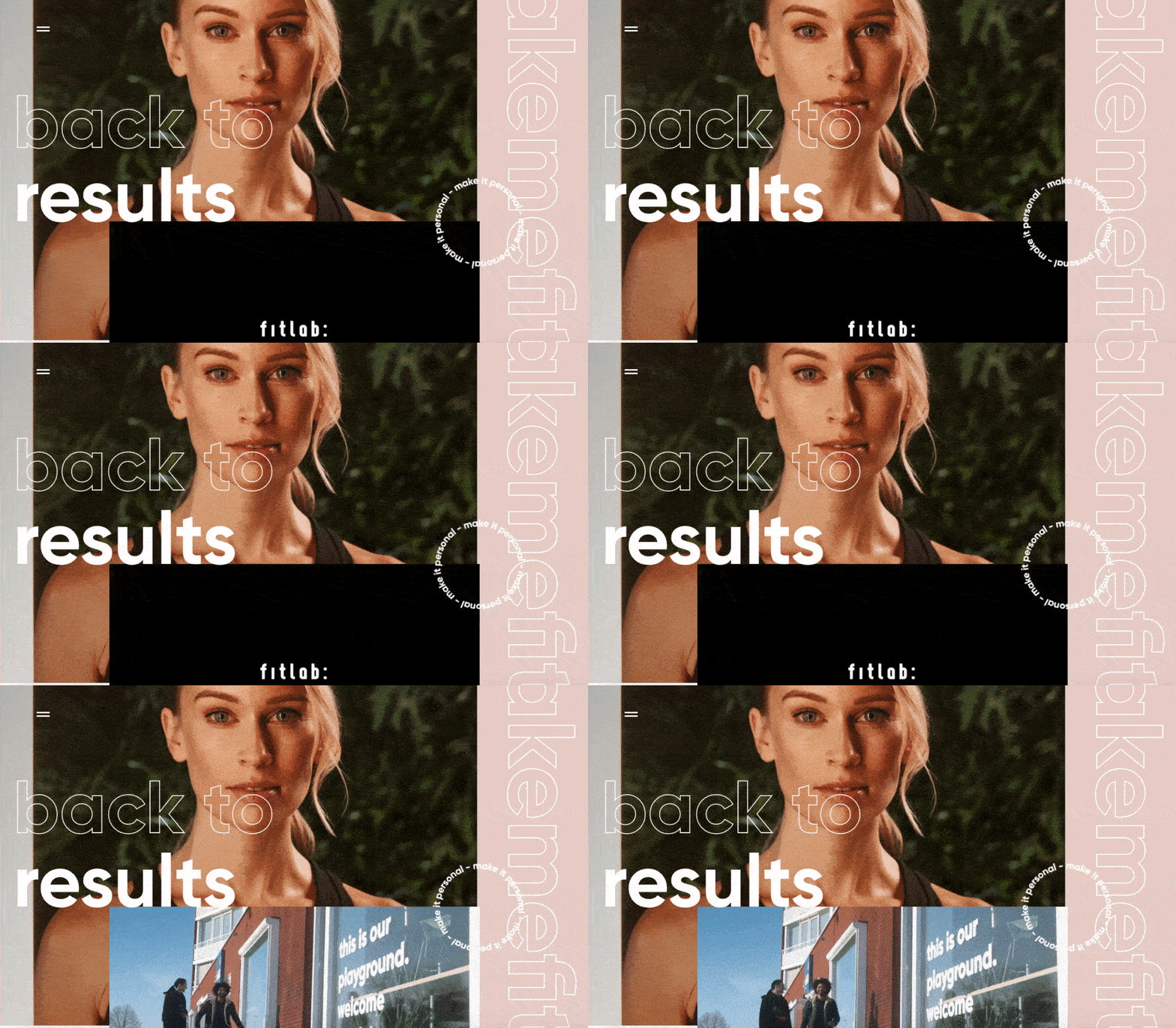
Additionally, all images and videos should be optimized for search engines and contain descriptive alternative text for accessibility reasons.
9. Calls to Action (CTAs)
Having an attractive website is great, but how do you know if your visitors are actually doing what you want? Are they engaging with your content? This is where CTAs come into play.
A CTA is any page element that prompts the user to take an action. The action could be adding a product to a card, downloading a content offer, or signing up for an email list.
Place your CTA elements prominently in the visual hierarchy, but not in an intrusive or distracting way, as is the case with many click-through ads.
If you need ideas for elegant CTAs that drive more conversions, check out our CTA sample list.
10. Space
As I mentioned above, sometimes it’s about the elements you have not contain. After reading these guidelines and requirements, you may feel tempted to clutter your pages with all the little things needed for a flawless UX.
Don’t forget that your viewers need space to process all this new information, so give your elements room to breathe.
But how much white space should you have? This is another personal call and varies from location to location. Therefore, user testing comes in handy here too.
What are people focusing on? Do you feel overwhelmed by the density of content? Here too, everything is related to our first guideline: simplicity.
Focus on design that puts the user at the center
When summarizing all of my advice here, keep one thing in mind: the visitor is number one and you are number two.
I know that sounds a bit harsh, as if you’re pushing your own desires and visions aside. But when you’re creating a website, you just have to imagine that you’re dealing with a first-time visitor.
Someone who has dropped by like a skydiver and needs to find what they are looking for quickly, otherwise they will simply leave your “destination” and “fly” on.
Once you get this mindset, designing the entire web layout will be a breeze.
If we go back to the beginning, you’ll remember that I once thought it was all about aesthetics. Today I am telling you that this is partly true. Yes, we still want it to look good, but if it’s not functional, beauty means nothing.
Simplicity. Smooth experience. No labyrinths. No confusing routes. That’s what the visitor needs. And that’s exactly what your website needs to offer.
Editor’s Note: This post was originally published in May 2021 and has been updated for completeness.

