The first place a potential customer might hear about your brand could be your social media, a passing ad, or even a recommendation from a friend. And if you’re one of the lucky ones, they might even visit your brand’s landing page looking for more.
Easy, right? You have them on your website, you will definitely buy them now! (But it’s usually not that easy.)
If your landing page doesn’t represent your service or product value well enough, you could be losing traffic simply because your team’s UI/UX could use a facelift.
And it’s even harder to sell your brand when you’re selling a SaaS software service where you can’t simply flash a tangible product but instead have to highlight features and use cases on your website.
Luckily, today I’m going to show you some of the best SaaS landing pages I’ve come across, explain why each one is effective, and give you inspiration for your own website. Let’s dive in.
Table of contents
Elements of a great SaaS landing page
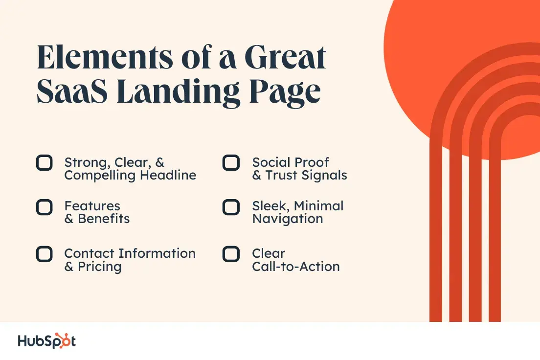
A few key components make up an effective landing page. Here are a few your company should prioritize:
- A compelling headline: A strong, clear headline that immediately communicates the main benefit or purpose of the software and captures the visitor’s attention.
- Social proof and trust signals: Security badges, privacy guarantees or money-back guarantees that help reduce concerns and reassure visitors in their decision to use the service.
- Features and Benefits: A focused section that describes the software’s key features and the specific benefits it offers users, often with icons or bullet points for clarity.
- Minimal navigation: A streamlined navigation structure keeps the visitor focused on the core message and reduces distractions, often by limiting options to only essential links.
- Prices and contact information: Users who have questions or need more information can easily access support or contact details. Where appropriate, a transparent pricing section explains different plans and pricing tiers to help potential customers understand their options.
- Clear Call to action (CTA): Well-placed CTA buttons that take visitors to the next step, e.g. E.g. “Register for free”, “Start trial” or “Request a demo”.
What makes SaaS landing pages unique?
SaaS landing pages are unique because they are specifically tailored to promote software services delivered over the Internet. Here are some elements that differentiate them:
- Focus on features and benefits: Unlike traditional product pages, SaaS landing pages emphasize the software’s features and the benefits they bring to the user, often in terms of productivity, efficiency, or cost savings.
- Demonstration of experience: Because SaaS products are intangible and rely heavily on user experience, these landing pages often include live demos, interactive elements, or video walkthroughs to help potential customers visualize how the software works.
- Promotion for the subscription model: SaaS products are typically sold on a subscription basis. Landing pages often include pricing models that illustrate different subscription levels, including details about the features available at each level.
- Conversion-oriented design: SaaS landing pages are carefully designed to quickly convert visitors into users. This includes strategically placed call-to-action (CTA) buttons, such as “Start your free trial,” that are clear, engaging, and actionable.
- User Testimonials and Case Studies: To build trust and credibility, these sites often contain testimonials from satisfied customers or detailed case studies that illustrate successful use cases of the software.
- Scalability aspects: SaaS offerings are known for their scalability. Landing pages often emphasize how the software can grow with the business, adapt to different needs, and provide ongoing updates and support.
- Technical and industry-specific content: They often address specific technical aspects or industry challenges and speak directly to an audience that is typically more knowledgeable about technology-related solutions.
- SEO and targeted traffic optimization: These landing pages often use SEO strategies to attract targeted traffic looking for digital solutions, further increasing conversion rates.
These elements combine to create a marketing tool specifically suited to the SaaS business model, focused on quickly and efficiently converting visitors into trial users or paying customers while effectively communicating the value of the SaaS product.
With all of these characteristics in mind, let’s look at some of my favorite examples of successful SaaS landing pages.
SaaS landing page examples we love
- HubSpot
- Shopify
- Adobe
- Okta
- Squarespace
- Asana
- zoom
- Bonterra
- Gynger
- Enfusion
- Tarro
- Dropbox
1. HubSpot
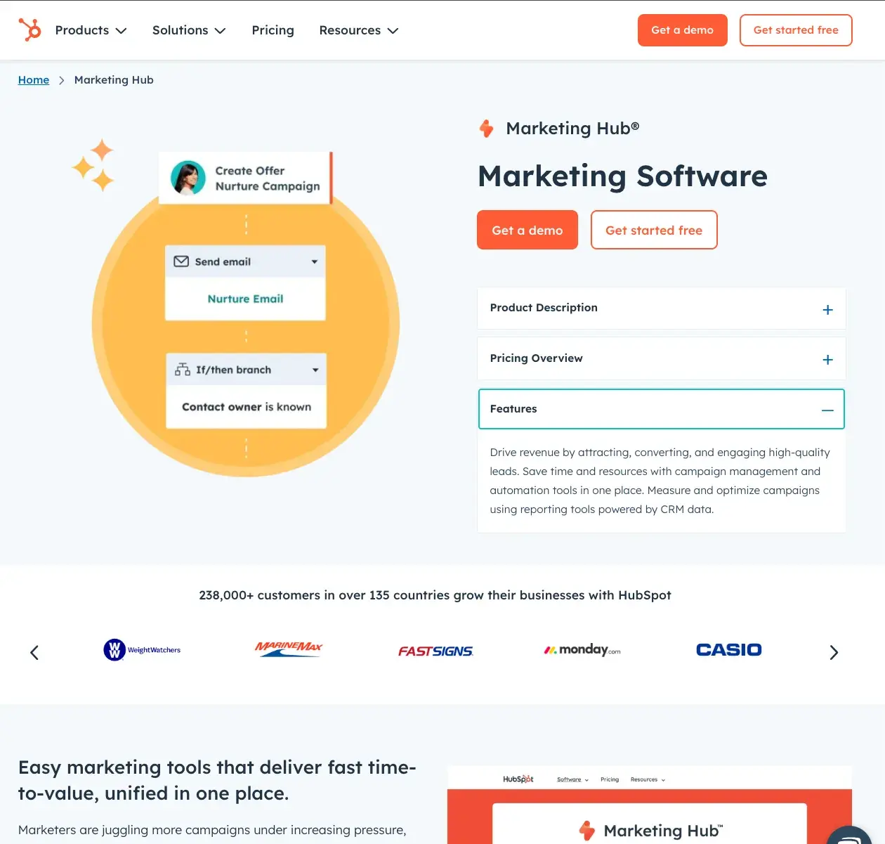
We don’t want to toot the horn, but we didn’t win 228,000+ loyal customers without establishing a consistent look and value proposition.
What I like: HubSpot leads with trust and highlights the importance of this by showing a carousel of satisfied customers it has worked with. Additionally, viewers who scroll down are greeted with real statistics about how they can expect HubSpot software to improve their goals through numbers like web traffic, inbound leads, lead generation, and more.
2. Shopify
Shopify is an e-commerce SaaS company and its creative and packed landing page shows customers that it can support your business – no matter what type of business it is.
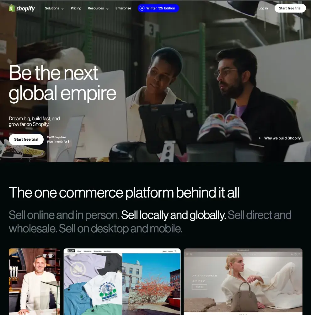
What I like: This landing page is dynamic in several ways. My gaze is drawn from a 3D model of a cash register to a changing customer segmentation graph to the front-and-center video of entrepreneurs “building the next global empire.”
3. Adobe
Although we all know that Adobe has an extensive catalog of services, the SaaS landing page presents it in a colorful, quick and easy way.
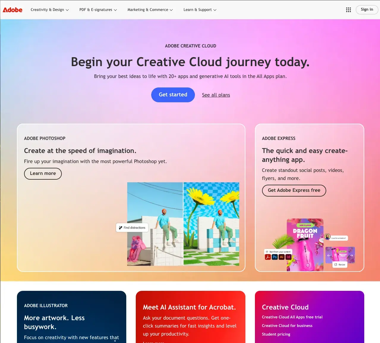
What I like: Use terms like “More artwork. Less Busy Work.” is based on the value that Adobe provides rather than listing features directly, and even I wanted to learn more about the features that provide that value myself.
4. Okta
Okta is an identity and access management company, and you can’t say that more clearly than on their landing page.
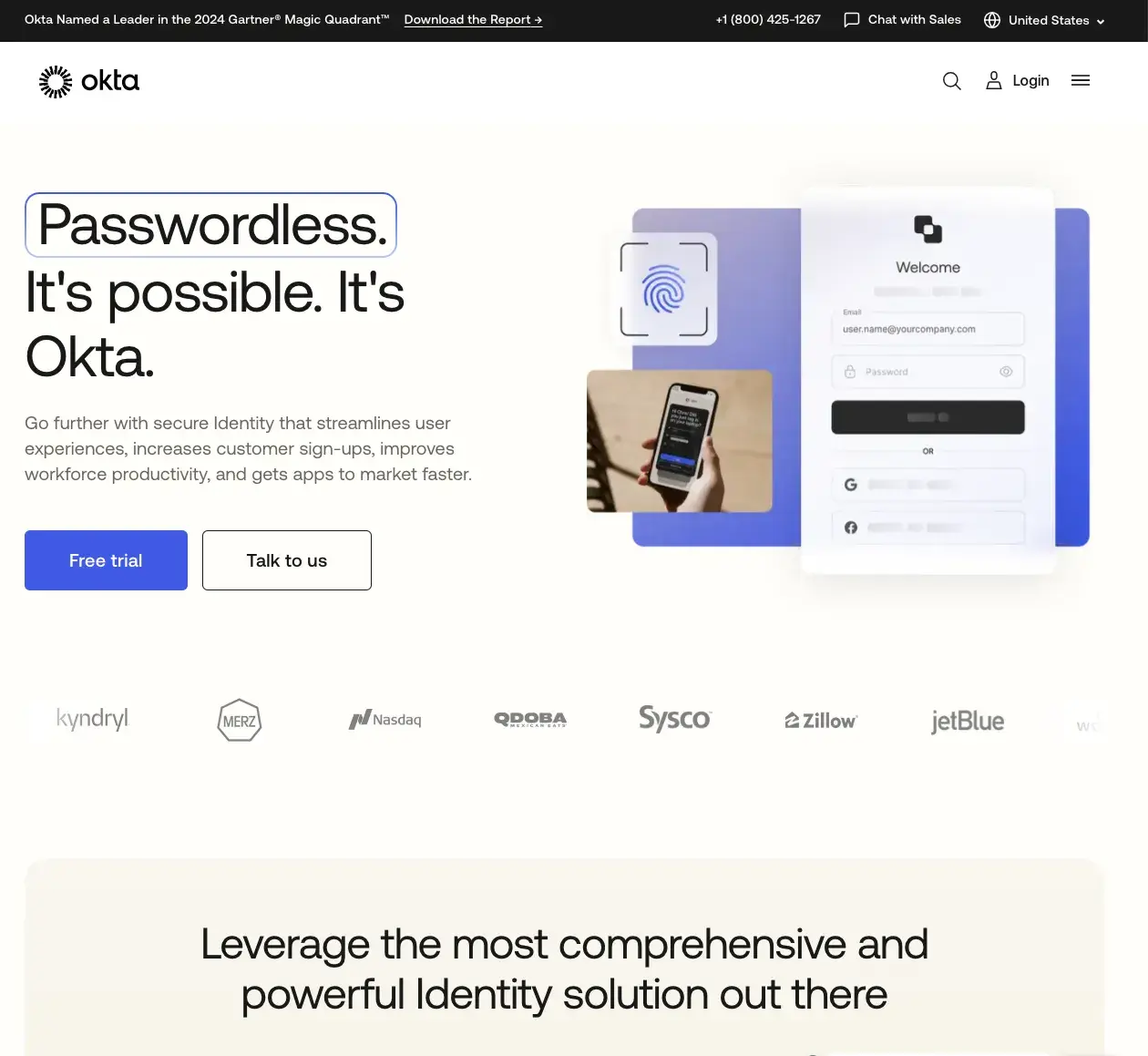
What I like: By using images reminiscent of fingerprint scanning and the option for two-step verification, potential customers know that they too will receive quick and secure access to your website – even with the offer of a free trial access to the website Start.
5. Squarespace
At first glance, you might think that Squarespace is a landing page for glass art? But if you know that it is actually website builder software, you can see that it tells a story to customers.
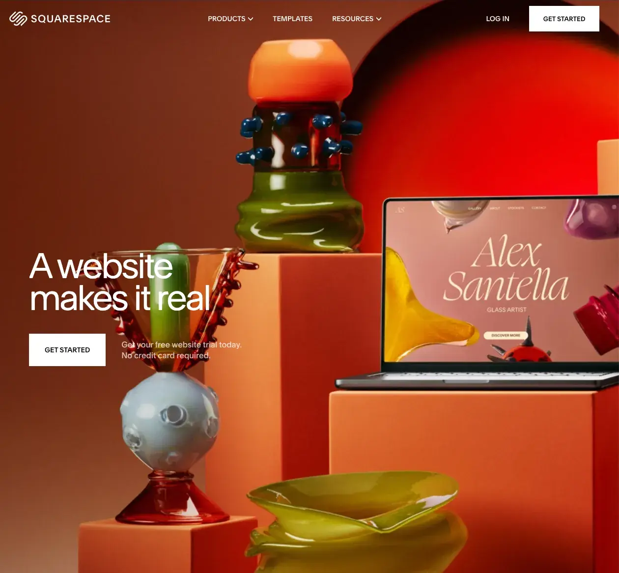
What I like: Squarespace guides the viewer to imagine a scenario in which they would like to use its service with a strikingly colorful image of a glass artist’s works. I think this is an extremely effective landing page because the look and feel of the sample website matches the setting we were shown.
Squarespace simply leads with a CTA that explicitly says “Get Started” without requiring a purchase to get started – a unique and pressure-free introduction to a SaaS brand.
6. Asana
This SaaS company is a work management platform with a clean and concise landing page that encourages customers to learn more about it.
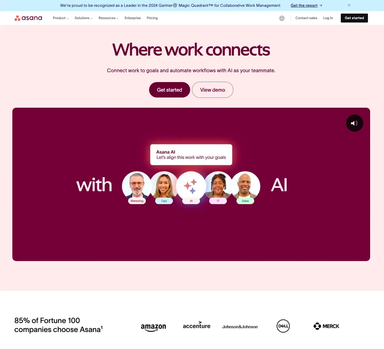
What I like: Asana showcases its CTA front and center, offering potential customers the opportunity to request a demo and an informative video explaining its work management software. Combined with a color palette that matches my own wardrobe, I’m a little biased when I say I like this SaaS landing page.
7. zoom
One of the most popular video calling software programs on the market, and the landing page shows that the brand knows its stuff.
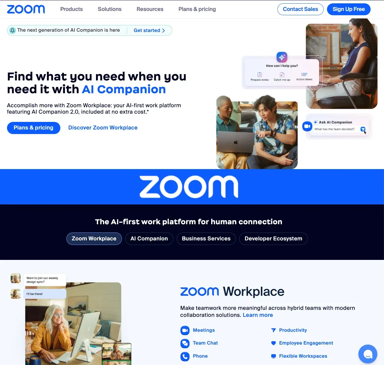
What I like: This landing page wastes no time in captivating me by introducing its capabilities and its AI companion. While almost everyone in a job or organization knows the company name, they may not know all of the real-world applications.
8. Bonterra
Bonterra is a nonprofit social impact software and its landing page highlights all the good it has done for various organizations and foundations.
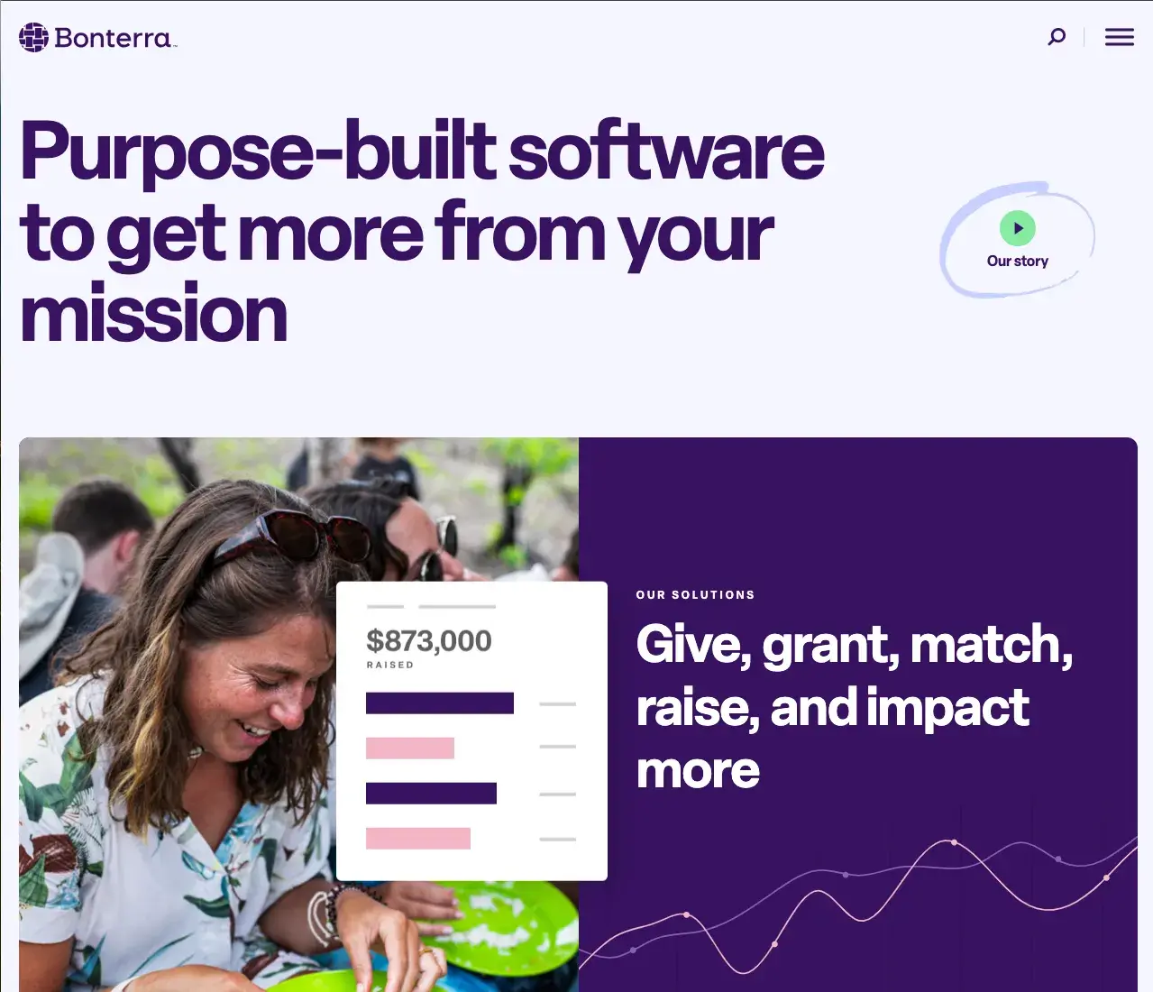
What I like: The company leads the way with trust metrics that show the number of lives “touched” by its software and years of service improving wellness programs. This social proof and emphasis on ethical financing attracted me, and I’m sure it will attract you too.
9. Gynger
Technical payments are made easy by Gynger, the first AI-powered payment platform and the landing page is top notch.
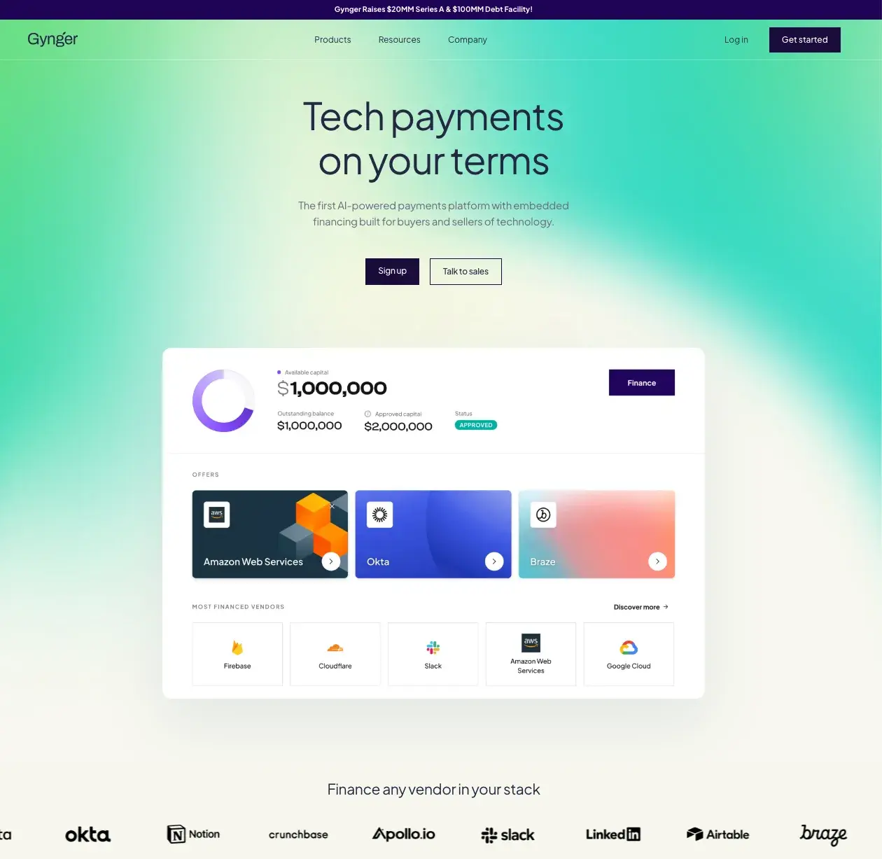
What I like: With its inviting green tones and cool yellow tones, the aesthetic and chic landing page for Gynger looks inviting. Combined with the carousel of compatible providers, viewers get a clear overview of what their financing technology can look like from the first click.
10. Enfusion
This cloud-native SaaS platform simplifies investment management operations and its landing page makes it easy to complete at first click.
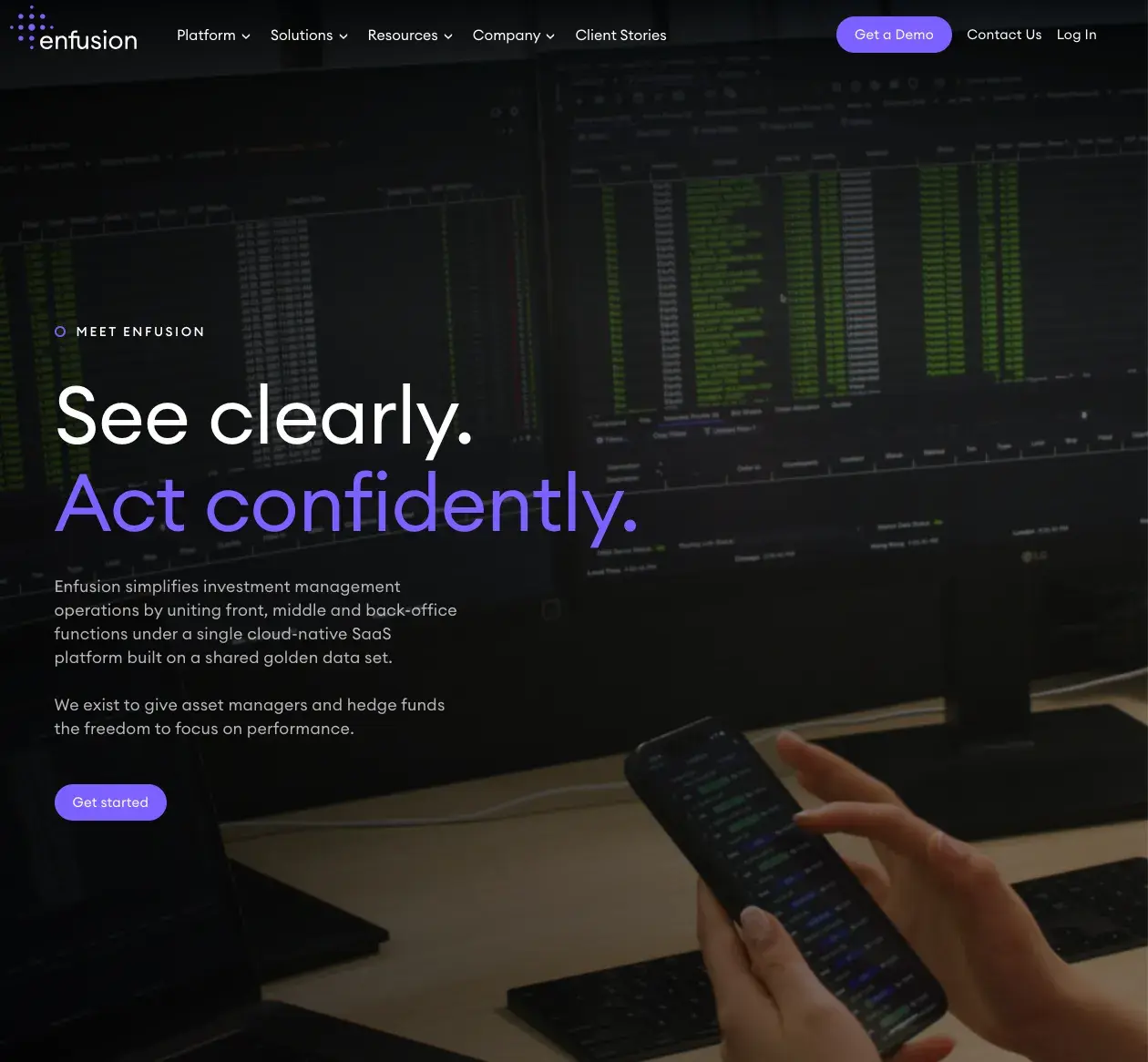
What I like: A good introduction piques readers’ interest, and Enfusion provides a detailed summary of the investment management activities it can offer for various clients.
11. Tarro
Tarro offers AI technology to better serve restaurant owners in managing phone orders, deliveries, and marketing – all very well described on the landing page.
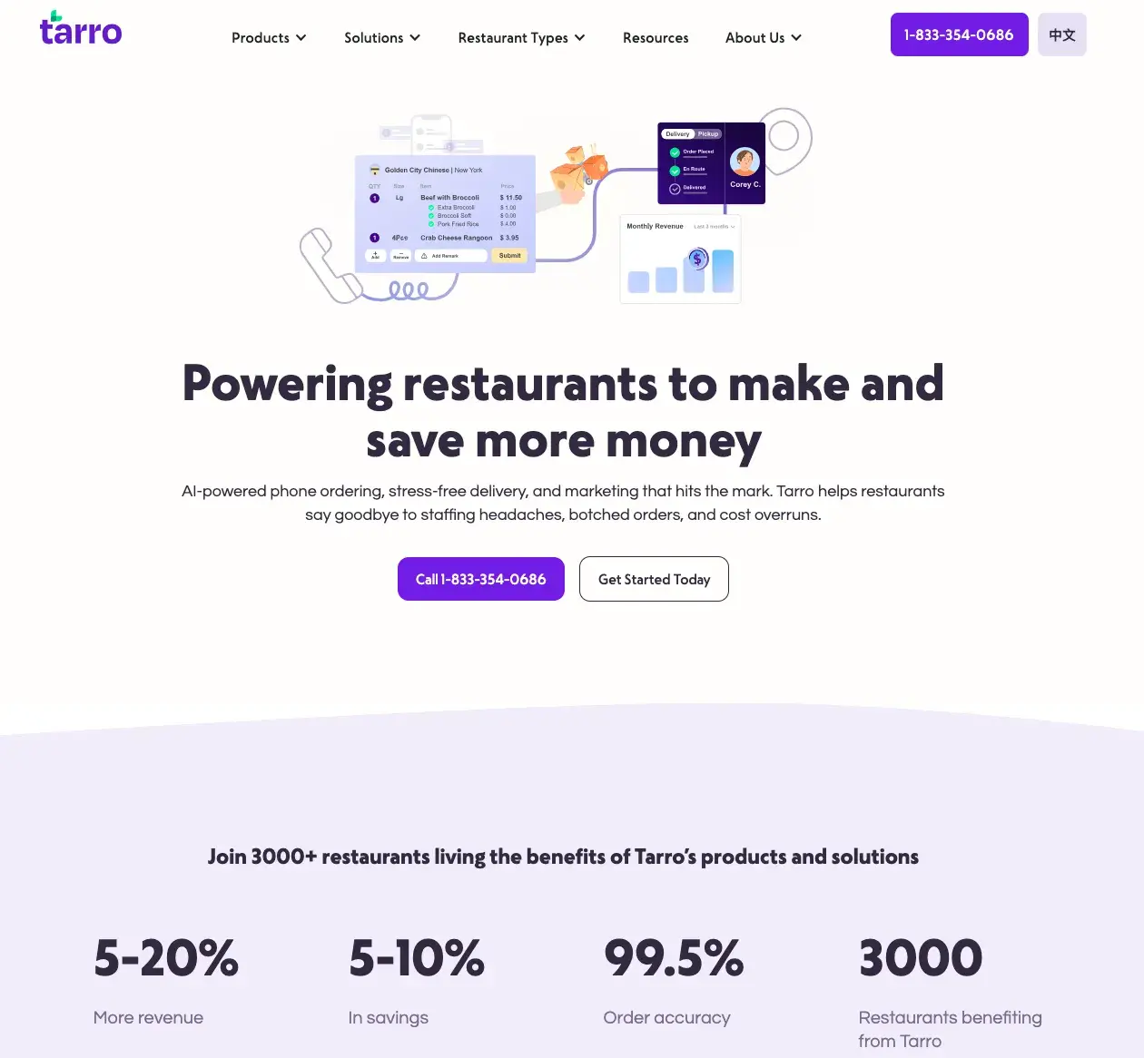
What I like: The proof of this lies in Tarro’s SaaS landing page – and even more so in its eye-catching statistics. The first headline sounds tempting, but when you look down the page and see real percentages for sales increase, savings, and order accuracy, it’s hard not to be interested.
12. Dropbox
Dropbox is a cloud storage service that allows users to store, share, and access files with ease – and its landing page tells customers exactly that.
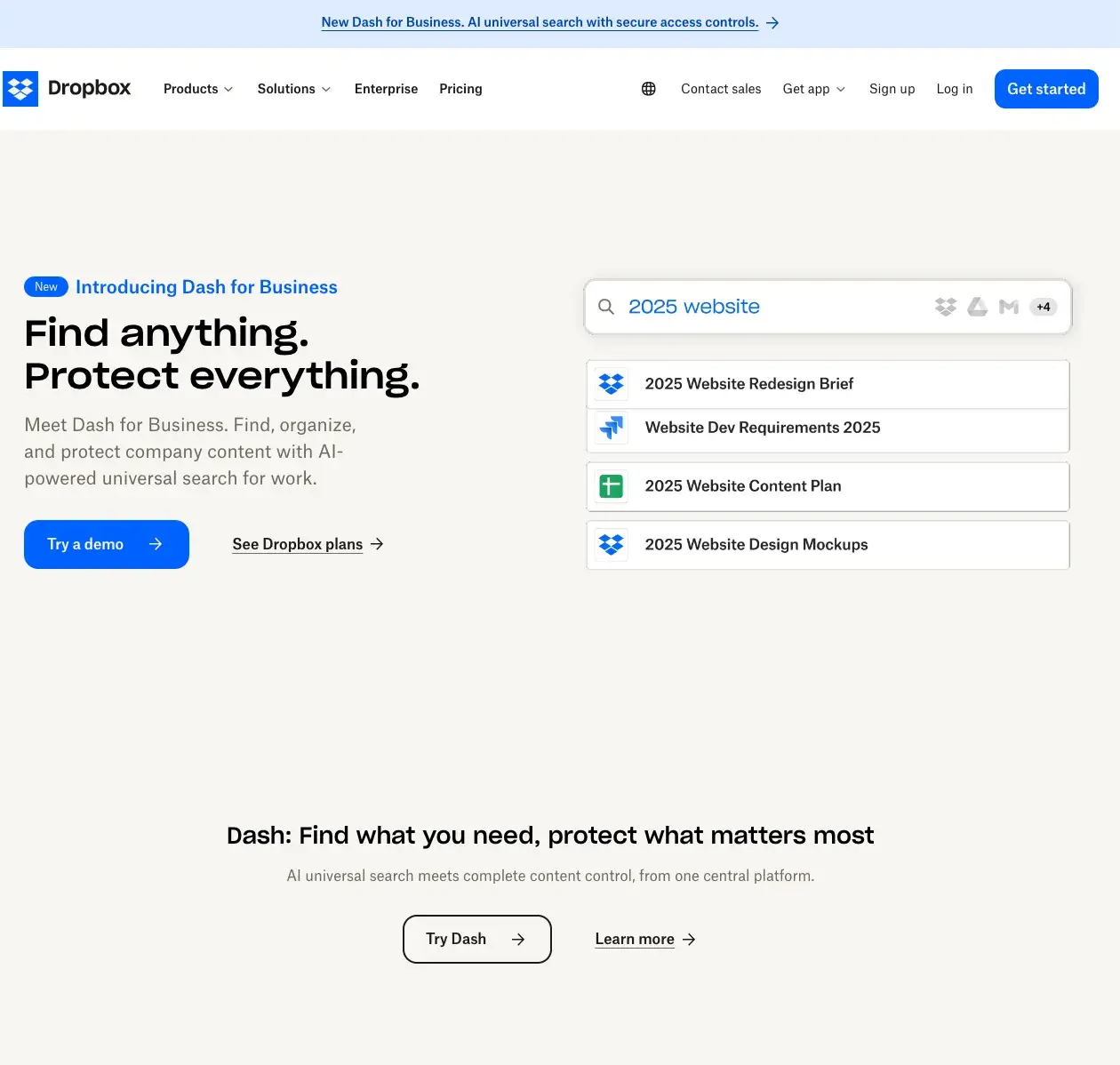
What I like: Short and sweet comes to mind when I see the Dropbox landing page. The opening statement describes it as “Dash for Business” and shows an animation of how your business can sort and organize documents according to your needs. This site proves that you don’t have to be flashy to be effective.
Help your landing page reach your customers
There’s no magic formula for creating the most engaging SaaS landing page, but I hope you’ve found inspiration and insights to help you tailor your landing page to your audience’s preferences.

